Effective Cartography
Elements of Cartographic Style
Maps are a vehicle that may transfer your ideas about a place into the mind of a map reader. This is a powerful yet delicate art. A well-made map is an instrument that frames a discussion of a place around the ideas that you feel are important. Despite the complicated data and analysis that may underly it, the best map is one that communicates its specific message to the viewer with a minimum of effort from the viewer. The work of maps is to cause people to think differently about a place. Success in this endeavor is best served by understanding and controlling the ways that maps are translated to ideas in the mind of the map reader. This page covers some of the essential properties of maps that communicate effectively:
- Establish Credibility
- Be Concise
- Use Intuitively Engaging Graphical Conventions
Topographic and Thematic Maps
The subject of every map is a place. Topographic Maps are designed to support a discussion of the essential physical and cultural components of a place and their relationships with eachother. Thematic Maps are designed to communicate more abstract quantitative or qualitative observations of things and conditions and their relationships with eachother and their context. Thematic maps should always include a reference overlay that reveals the essential topographic framework of the place and its context. The job of the map-maker is to introduce the place and to portray data to stimulate an intelligent conversation. An effective map will be interpreted in a predictable way by most users. It will stimulate the right sort of questions about the subject. A critical mapmaker, will be able to predict distracting questions, or predictable mis-interpretations, and will adjust tne map as necessarry to focus the discussion on pertinent details and labels.
The discussion that follows assumes a familiarity with the ideas presented in the lecture presentation: Geographic Models in Decision-Making Context and Fundamentals of Map Projections. For a set of sample maps that illustrate the principles discussed on this page, see Sample Maps
Outline
- Elements Every Map Should Have
- Graphical Hierarchy
- Requirements for Local Context Maps
- Requirements for Regional Context Maps
- Requirements for Thematic Maps
- Conventional Shades for Land Use Maps
- Quantitative Thematic Maps
Resources
Elements Every Map Should Have
Every map is an exercise in selective emphasis and clarity. You are concerned with communicating key concepts and relationships of an area of interest and the relation of these with the immediate surroundings and the greater region. Data are chosen to represent these concepts; and the data are transformed into graphics portrayal in planimetric scale, and with a graphic hierarchy that makes it intuitively easy for the reader to discover the key concepts and relationships that you intend to emphasize. The art of selecting, transforming, and portraying information on a map involves the delicate balance of anticipating and answering reasonable questions related to your subject, while not overwhelming your reader's attention with needless detail, or forcing the reader to work in order to figure out what your map is intended to communicate.
- Include a Title that indicates the purpose for the map. This is a matter of being concise. Don't make me guess what you are trying to communicate with this map.
- Put your name, your institutional context, and the date on each map. E.g. Paul Cote, GSD6322 Assignment 1, February 11, 2008. A savvy map user expects a map to be biased, depending on the circumstances of its creation. Why should anyone invest any trust in an anonymous map?
- Include a caption that explains the critical concepts and relationships you are trying to illustrate. WIthout an explanation of the purpose of the map, the user may waste their time trying to figure out what the map's intention is. Or, more probably, they will simply scan over it, and move on.
The caption should convey an idea of what specific concepts are being explored by the map, and how a specific dataset has been used to portray an estimate the pattern that these concepts create on the ground. A good caption will reflect on the fitness of the data as an exact reflection of the ideal concepts. If this point is not made, the implication will be that the mapmaker trusts that the map is a perfect representation of reality. One way to make this simpler is to simply be clear that the map is a portrayal of a specific collection of observations made on a certain class of real world objects, using a particular method.
- Label Key Elements on the Map. Certainly, any feature that you mention in your caption should be clearly portrayed and labeled on your map. Other reference features that might be part of a discussion of the place, ought to be labeled as well.
- Cite the primary sources for your data and their dates. Am I supposed to believe that you actually measured all of these data yourself? If you don't know the name of the authority responsible for the content of the data, or the time period that the data are intended to represent, then say so.
- Put a grapical scalebar on the map Most maps these days are intended to be viewed on computer screens or projected against a wall. In these cases, a scale expressed as a fraction, eg. One Inch to One Mile or 1:63,000, is almost guaranteed to be wrong. In all cases a map should include a graphic scale bar. Only include fractional scales if you never to share your map in any other way than paper prints.
- Cite Projection Method and Case All maps below a scale of 1:500,000 should be based on an apropriate local map projection and case that has planimetric scale properties -- that is a scale that is constant in all directions and across all portions of the map. The north-south and east-west axes should be at right angles to each other. These properties assure that shapes and relative sizes of objects and distances will be represented correctly. Understanding that your map has these properties requires a knowledge of the projection method used to transform the data for portrayal on the map. Therefore your choice of map projection method and case should be stated near to the north arrow and scalebar.
- A Concise Legend, if Necessary: The map legend should be reserved for making key distinctions that are important for understanding the points you are making in your caption. Not every symbol used on the map needs to be in the legend. When the symbology on the map is self-explanitory, or if the distinctions being symbolized are not an aspect of the key concepts being described, then the map symbols should speak for themselves. When legends are included, the headings and descriptions should always be in plain english, avoiding cryptic file names and attribute codes. More tips on legends are discussed in the section on thematic maps, below.
Graphical Hierarchy
Your map should serve as a diagram that portrays the key concepts that you describe in your text in terms of their relationships with each other and with the features of the landscape. A good treatment will use graphical hierarchy that brings the most important concepts to the foreground. In the middle tier of your hierarchy you should provide a framework of reference for named places and circulation. There may be a gradation of emphasis among reference elements. For example you can use line-weights and colors to portray different grades of roads. When color portrayal is an option, the color white should be reserved for non-map areas, such as margins, and the background of legend and text boxes. Other aspects of graphic hierarchy are discussed in the sections on topographic and thematic mapping.
Large Scale (Area of Interest) Topography 1:10,000 - 1:1,000
Topography at a closer scale should focus on the specific area of interest for your a design study, including those surrounding areas that directly impact or are directly impacted by the phenomena going on or proposed in your study area. Your map should be a reference tool that provides a stranger to the site with all of the terms necessary to carry on a discussion of the key issues that will arise during the discussion of alternative design or policy proposals. When discussing an area with neighbors, you will earn trust if you show that you are familiar with the names of places within the area of interest and its surroundings. Conversely, if your map and discussion disregards key elements of the area, the people whom you are trying to persuade may feel that you have not taken the time to understand the critical conditions on the ground.
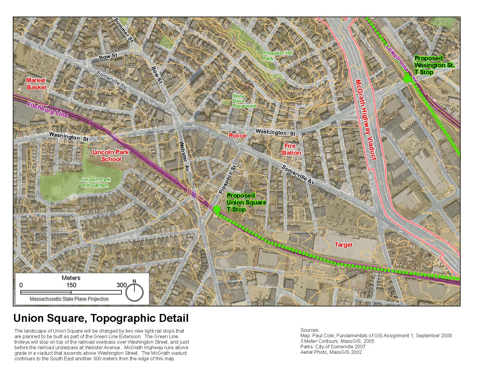
Questions Answered
- What defines your area of interest. Is it defined by actual barriers in the landscape, or distinctions that are discernible? or is it simply a polygon on the map?
- Portray the circulation within the site and surrounding area. Provide names.
- What are the key named places and features within and around your area of interest?
- Are there critical subdivisions of your area of interest? The answer to this question will depend on what your choice of key concepts and relationships. If these are complicated, you will want to show these on a separate thematic map.
Graphic Hierarchy
- Foreground:
- The boundary of your area of interest
- Places and features within and surrounding the AOI that are mentioned in your caption. (labeled)
- Reference:
- Roads, railways and pedestrian/bike easments should be portrayed and labeled.
- Civic places and parks (labeled)
- Places of interest to denizens of the place (labeled)
- Contours at an appropriate interval. Contours should be labeled
- Background: Notes about background discussed regarding small scale topography
also apply here. You may additionally consider adding these features if data
availability and map scale permit:
- Building figure ground -- if data and scale permits.
- Aerial photographs are useful as background, but should be used with transparency in order to keep them from overwhelming the rest of the map.
For an example of a decent regional context map, see Sample Maps Page 1.
Small-Scale (broad area) Reference: Regional Context
Developing and communicating ideas about a place, you and your collaborators and clients will have predictable questions that should be addressed in a regional context map.
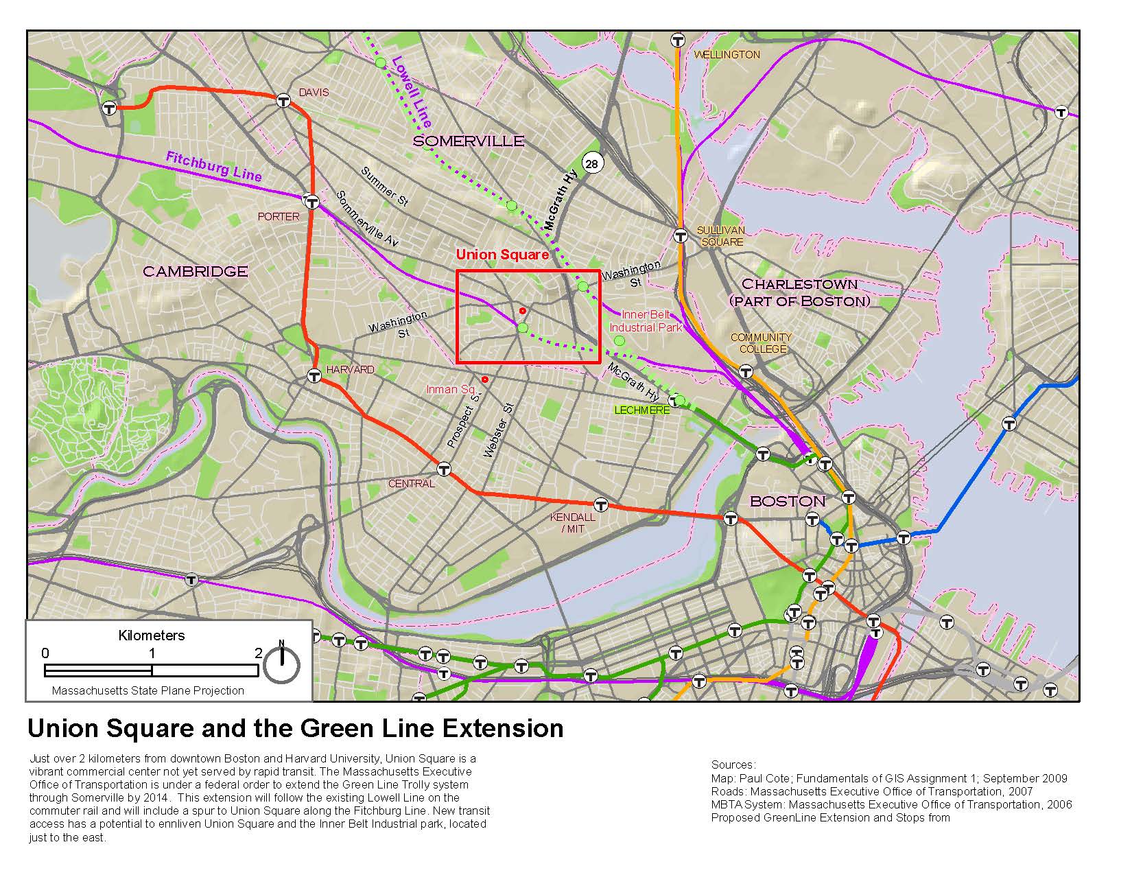
Questions Answered:
- Where is the area of interest within the network of named places and geographic features that we may assume the audience is familiar?
- What are the important routes to and through the area of interest? What are their names?
- What are the named physical features, and landmarks within and in the greater region that may be important for discussing the area of interest and the concepts you intend to emphasize.
Graphic Hierarchy
By regulating the brightness and line weights in the portrayal of specific features, you help the reader to gather the ideas you are presenting, and to answer their own question in the proper order of emphasis.
- Foreground:
- The boundary of your area of interest (labeled)
- Named places, and other features related to your argument (labeled)
- Reference:
- Named places, large parks, water bodies,
- Transportation features involved with accessing your area of interest should be labeled. Other major roads and railroads should be shown using their own graphical hierarchy.
- Administrative boundaries of interest.
- Background: transparency of these layers can be used to mix lots of information together whithout dominating the map. Note that in ArcMap, you can set a default background color of a data frame.
- Parks and Preserves (green), Land Areas (buff), water areas (blue). You may be able to get away with adding a couple of other classes of land use: e.g. residential (buff), Commercial (pink) industrial (violet), and other (grey). But this amount of land use detail may be better portrayed on a separate thematic map (see notes on categorical maps, below.)
- Incidental transportation features: depending on the scale of your map, you will show a background of minor roads. Of course if at your scale, these all become coalesced together, then don't.
- Shaded relief. Note that shaded relief simulates the shading that would be seen if relief features were actually sticking out of the map and are illuminated by a light source overhead. This simulated shading should incorporate shades of grey. Beware that whatever other thematic colors you are using should not use shades of light and dark that may become indecipherable when displayed with shaded relief.
Here are some examples of effective regional context maps and thematic maps:
- Sample Maps Pages 1-4 and Page 9.
- the Two Hectare Project from the Harvard GSD Masters of Landscape Architecture class of 2008.
Thematic Maps
Beyond an understanding of the current context of a place, many documents will include maps that portray data that helps to support some assertion that one may want to make about a place as it relates to other places (in terms of land use or demographics or some other theme.) These are known as thematic maps. Thematic maps symbolize features according to the value of their attributes. These attributes may be qualitative, or quantitative. In the case of quantitative maps, we make a distinction between attributes that represent raw quantities versus measures of intensity. The page, Critique of Data, Metadata and Referencing Systems for more discussion of referencing systems for qualitative data.
Future exercises and in-class discussions will discuss the principles and techniques of communicating critical ideas about places using Mapping with Categorical Data and Mapping with Quantiative Data. For the present, just keep in mind that your thematic maps wil be much easier to understand if you first present the critical aspects of a place in its context with a topographic base map. And you can further leverage this work by using some of the same contextual framework as a common frame in your thematic maps.
Elements that Every Thematic Map Should Have
All of the requirements for maps, of portraying a contextual framework, listed above, apply also to thematic maps. There are additional considerations that also apply when we are trying to portray other sorts of measurements and observations on out maps.
- Contextual Framework Portraying data without some frame of reference results needless difficulty for your audience to understand the relationship of the data or phenomena with the key places in and around the area of interest.
- Concise, evocative legend Your thematic data should be recategorized if necessary so that your readers are not challenged to keep track of more than 8 different classes. Seven, maximum.
- Use plain terms in legend headings and labels If you accept the software defaults for your legend labels and headings, people who understand maps will also understand that you simply don't care about communicating.
- Try not to hide important information in arbitrarily broad categories The categories portrayed in the legend, whether qualitative or quantitative, should highlight distinctions that are useful.
- Discuss the Areal Precision of Mapping Units Whether the data are quantitative or qualitative, thematic data have a particular granularity. For example Census Data may be aggregated at a Block level or Tract. Land Use Data may only register distinctions for patches of ground larger than a stated Minimum Mapping Unit (like 5 acres, or a 90 meter cell.) Your discussion or your lagend should indicate that you understand that the spatial and categorical lumping inherent in the data may smooth over significant patterns.
- Graphical Hierarchy the same ideas about graphical hierarchy that apply to topographic maps may also apply with thematic maps. This is especially true with regard to the foreground layer of key topographic features and a reference layers to provide context. You may decide to drop some of the labels used in your reference layer -- particularly when your map document includes separate maps for presenting the contextual framework. Typically, the thematic layer will be the background layer of the map but you may also use transparency and an aerial photo at large scales, or shaded relief at smaller (broader) scales. When mixing background layers with transparency you should be careful that whatever background layers you use -- particularly aerial photos and or shaded relief, to not make the key distinctions in your thematic layer more difficult to read.
Color Conventions for Land Use Maps
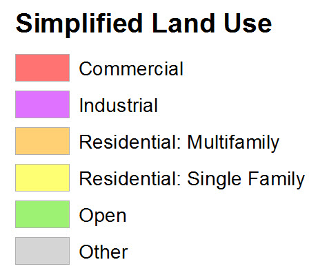
Conventions for coloring map are a means of streamlining communication. Land use professionals have a general vocabulary of colors for representing the primary types of land use. Yellow shades are understood to represent residential, Reds: commercial and retail, purples: industrial; Light blue may be used for institional uses. Within a class a darker color value for each hue can be used to express a gradation of higher intensity development.
Using conventions reduces the effort required to read your map. Conversely - and more importantly, if you create your own shading scheme without any relation to the norms of your field, then you are certain to confuse people. The effect of this will either be miscommunication or aggravation on the part of your audience.
Quantitative Thematic Maps
Maps that portray quantitative measurements or summary statistics use tricks of graphics that cause the audience to visually weigh and compare aspects of places. Making effective quantitative maps and interpreting them requires an understanding the two major types of quantitative data: Intensive Statistics, versus Raw Counts; and how the intuitive computer of the eye/mind interprets symbol color intensity versus symbol size.
For a deeper discussion see Mapping with Quantitative Data.
intensive statistics (e.g. heat or concentration) versus extensive, count statistics (e.g. weights or counts).The cartographer should also understand two major classes of symbols for portraying quantitative properties: Proportional symbols change their visual weight according to a quantitative property. These are appropriate for extensive statistics. Choropleth maps portray data collection areas (such as counties, or census tracts) with color. Color is best used to represent intensive statistics such as percentages or densities. When using color this way, observe how the darkness and intensity (or value) of the color is evaluated by the eye as a measure of intensity or concentration.
Whenever you include a map portraying a proportion, such as Percent of housing units that are rentals you should include a map that shows the density of the total -- e.g. Total housing units per acre. It is often the case that areas that are near the ends of the scale in terms of proportion are ones that have very little actual activity in them.
Whenever your legend involves quantities of any type, your legend title or labels should explicitly state the units! When normalizing for density, please use an areal unit that has an evocative scale. Can you create a picture in your mind of 10,000 people in a Square Kilometer? What about 100 People in a Hectare? (two soccer fields.) Convert your units so that your users can imagine the actual tings and cinditions that you are referring to.
| Handy Conversion Factors | ||
| You Have: | Acres | Hectares |
| Square Miles | * 640 | * 259 |
| Square Meters | / 4,047 | / 10,000 |
| 0.001 Square Kilometers | * 4.047 | * 10 |
YOu may want to check your work with this handy online area conversion calculator
If you want to portray several statistics at the same time, avoid the temptation to 'normalize' your data more than once. These compound fractions are very difficult to interpret. It is much better to provide several maps in easy-glance distance from each other. See example of a PDF document with several maps bookmarked.
Example Demographic Maps
- Sample Maps Pages 5-8.
